Trends
Less neutrality, more character
In 2026, design trends are taking a more decisive direction. Colours gain depth, materials express themselves fully, and spaces become more personal, more legible, more human. Moving away from rigid codes and uniform aesthetics, a new design language is emerging: spaces conceived for wellbeing, use and emotion, where every aesthetic choice has meaning.
Colours 2026: from serene expression to deeper emotion
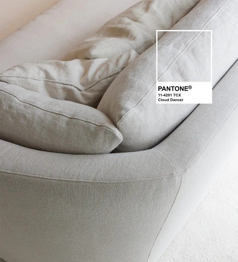
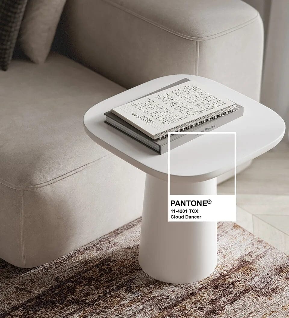
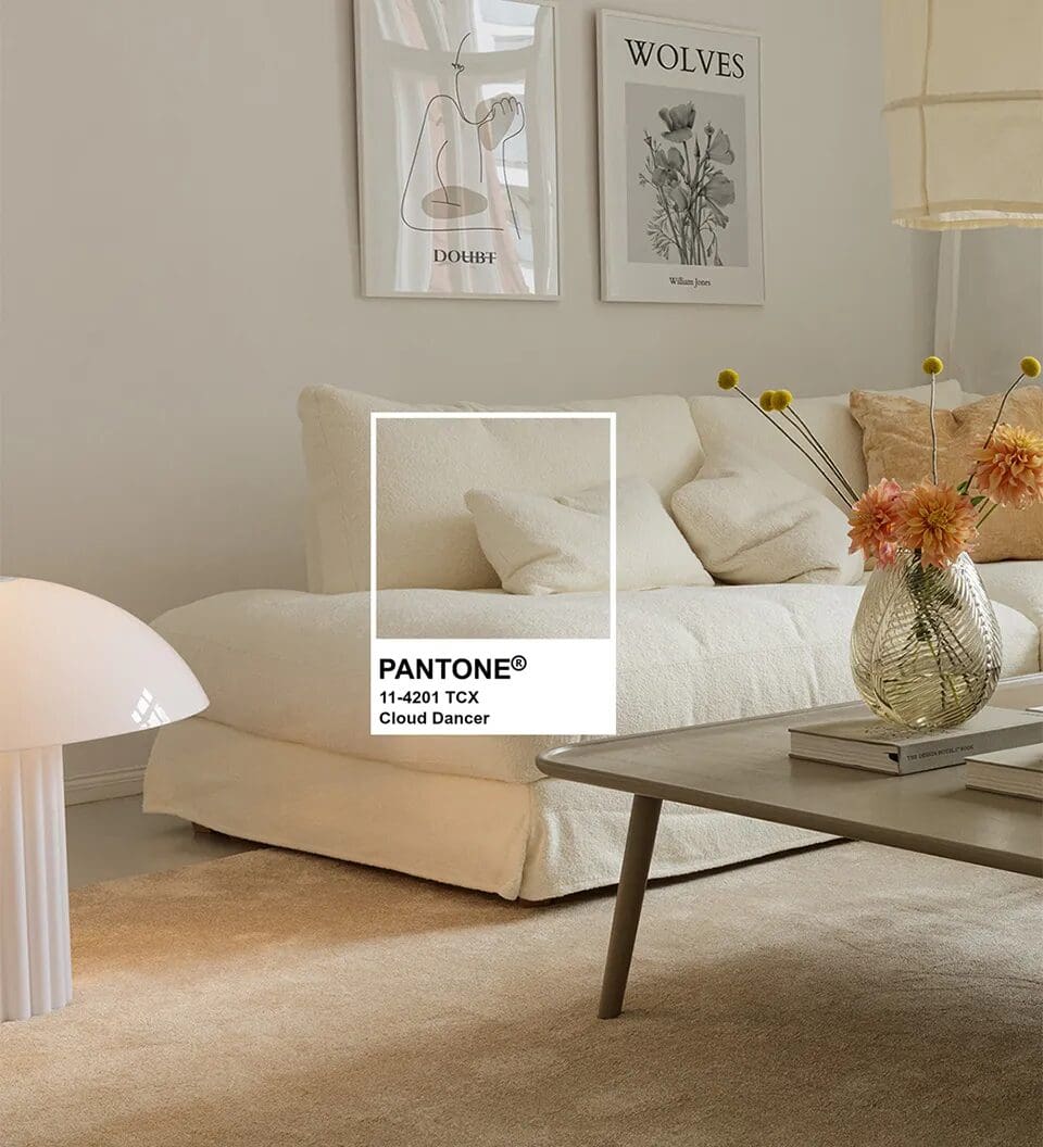
Cloud Dancer: a quiet revolution in the Colour of the Year
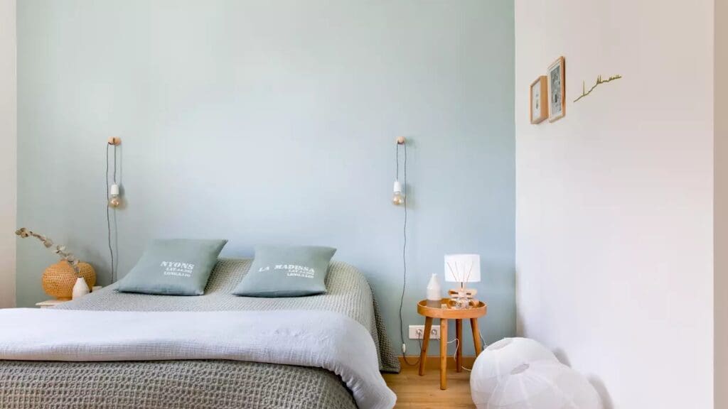
For 2026, Pantone has made a historic choice by naming Cloud Dancer (PANTONE 11-4201) as Colour of the Year. For the first time, a subtle, airy white takes centre stage. Far from being clinical, this warm and inviting shade feels almost meditative, symbolising clarity, calm and peace — a neutral canvas for a fresh start.
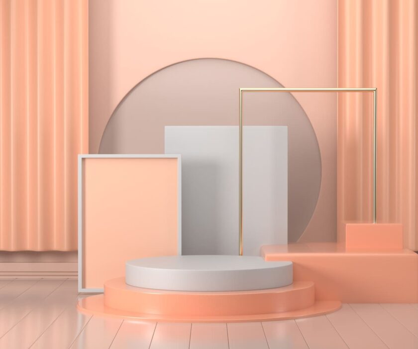
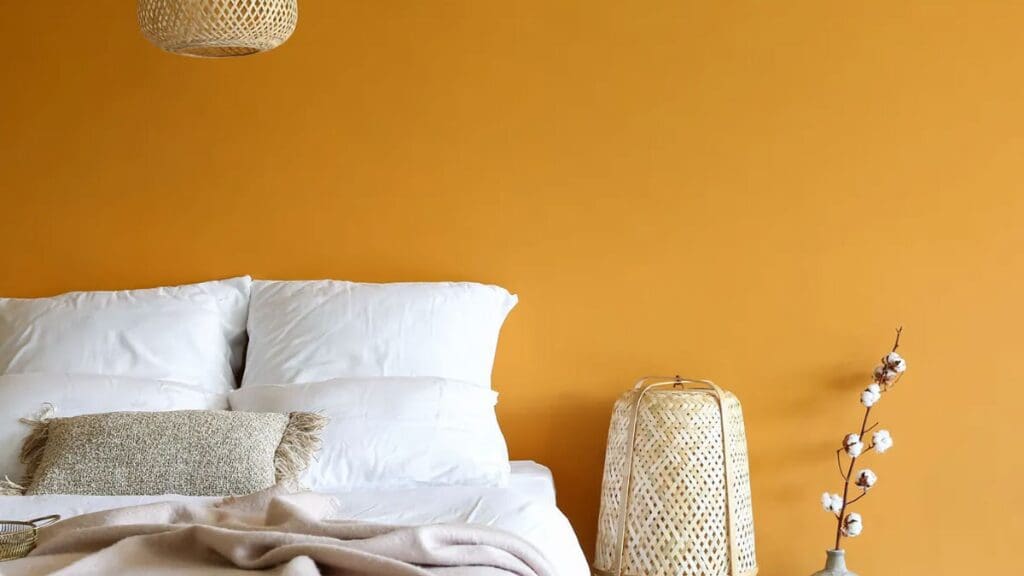
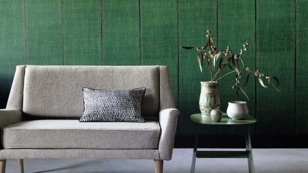
Beyond neutrals: rich and contrasting palettes
While Cloud Dancer embodies visual breathing space, colour trends for 2026 extend well beyond neutrality.
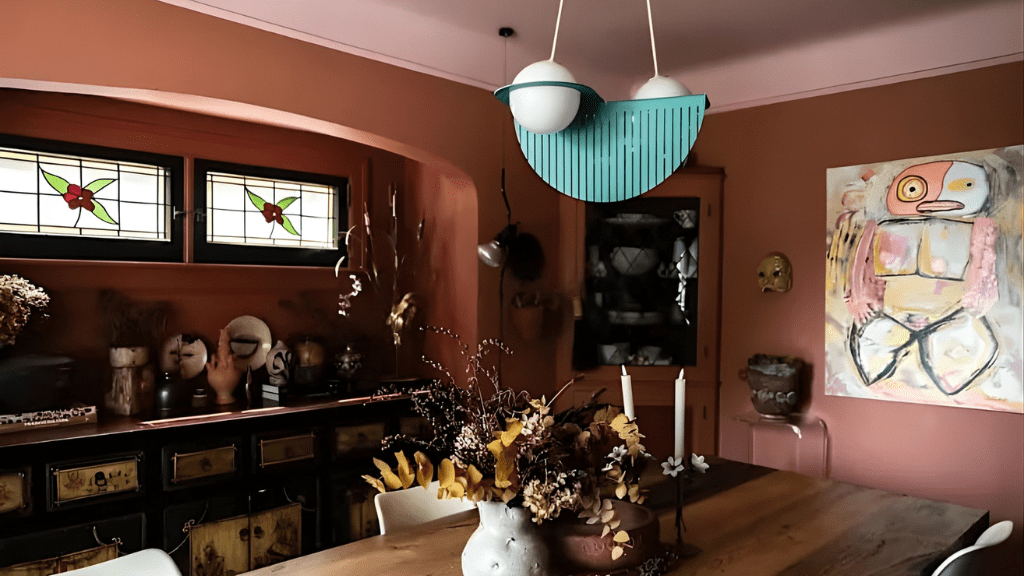
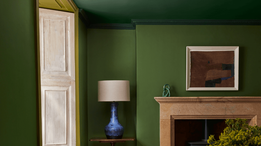
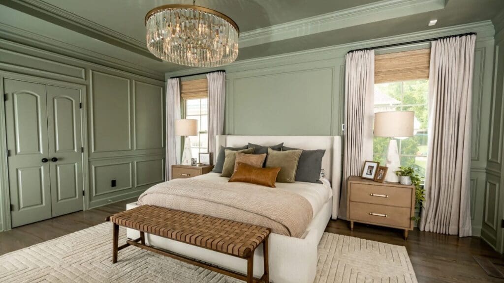
- Deep, earthy shades such as luminous ochre, powdery blues, inky greens and warm browns are gaining momentum, pushing aside the cool greys of recent years.
- This warm palette reflects a broader movement towards intense, natural and emotional tones, answering a growing need for authenticity and a stronger connection to materiality.
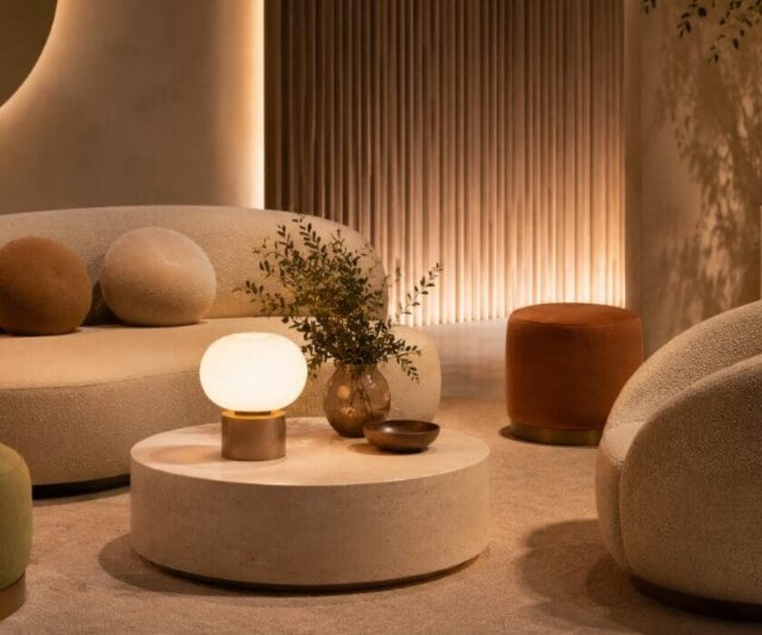
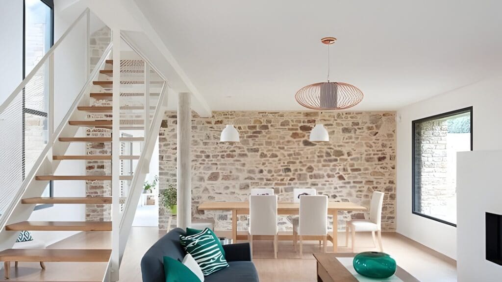
Architecture & interior design: light, texture and character
In architecture, these chromatic directions are echoed in spatial and material choices.
- Natural light is maximised and combined with light surfaces: Cloud Dancer fits seamlessly into projects that use light as a tool for spatial perception and comfort.
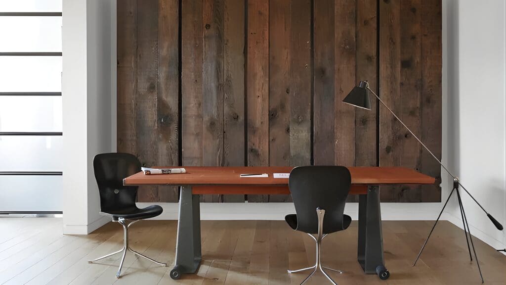
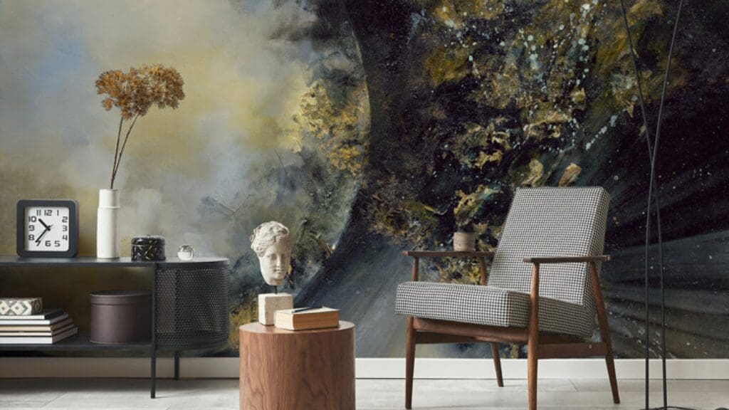
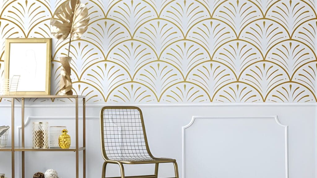
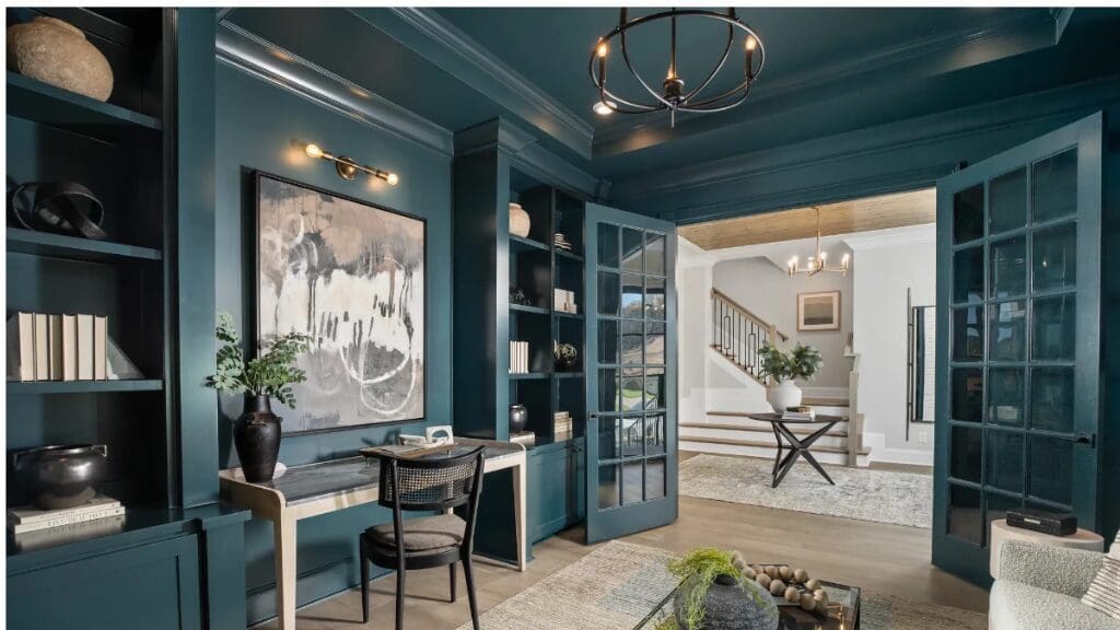
- Natural, tactile materials are making a strong return: raw wood, expressive stone and textured textiles anchor spaces in a strong sense of material presence.
- Layering materials and volumes: contrasts and visual depth.
- A blend of vintage pieces, contemporary furniture and sentimental objects for a more lived-in aesthetic.
This architectural movement gradually shifts away from strict minimalism towards a more human, sensory-driven approach.
Alongside certain visual strategies are gaining popularity:
- Colour capping, which involves working with several shades from the same colour family, applied in a gradient from the lower walls up to the ceiling. Colour capping structures volume, guides the eye and brings new depth to a space.
- Colour drenching takes the approach even further: a single colour is applied throughout the entire space — walls, ceilings, joinery and sometimes furniture — to create a strong, cohesive and almost scenographic sense of immersion.
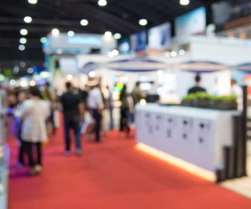
In exhibition stand design, 2026 trends confirm fundamentals that have become essential. Natural and sustainable materials — wood, organic textures and greenery — enhance authenticity and a sense of welcome, while deeper, nature-inspired palettes create immersive environments aligned with brand identity.
Stands are increasingly conceived as true scenographic journeys, integrating light, content and interactive elements to engage visitors.
Finally, modularity and re-use are now strategic and responsible imperatives — an approach FG Design has embraced for many years, well before these principles became trends.